How to Choose the Right Colours and Fonts for Your Logo Mat
Welcome to our guide on logo mats in Ireland Whether you’re a small business owner or a branding newbie, this guide will help you understand how to choose colors and fonts for your logo mat. We’ll keep things simple, clear, and practical—just the way you like it.
Introduction: Why Your Logo Mat Design Matters
How Logo Mats Impact First Impression
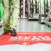
When someone walks into your premises, their eyes often land on the entrance floor first. A logo mat does more than just clean shoes—it quietly represents your business. A thoughtfully designed mat gives off a sense of professionalism, attention to detail, and brand clarity.
Importance of Branding Consistency Across Touchpoints
Whether it's your business card, website, or mat—your brand visuals should match. That means colors, fonts, and logos stay consistent to create trust and memorability. It's all about branding with custom mats that reinforce who you are.
High-Intent Keywords Covered:
-
Benefits of custom logo mats
-
Logo mat branding tips
Understanding the Role of Colours in Logo Mats
Color Psychology in Branding
Colors have a voice of their own. Red is lively and bold, blue gives a sense of trust, while green brings calm and freshness. Pick colors that echo the vibe you want your space to give off. This is where color psychology for business mats comes into play.
Choosing Colors That Represent Your Brand Identity
Think of your brand personality. Is it playful, formal, eco-conscious, or luxury-driven? Match your mat colors accordingly. For example, a spa might use soft greens and creams, while a tech company may opt for sleek blacks and blues.
Matching Mat Colors with Interior Design or Flooring
Choose mat colors that work well with your surrounding decor like floors and furniture. Aim for balance—not too loud, not too dull. Plus, deep shades are practical since they show less dirt, which helps maintain a cleaner look.
High-Converting Long-Tail Keywords:
-
Best colors for business entrance mats
-
How to pick mat colors that hide dirt
Font Selection for Logo Mats: Style Meets Readability
Serif vs Sans Serif vs Script: Which Fonts Work Best
-
Serif: Classic, trustworthy (e.g., law firms)
-
Sans Serif: Clean and modern (e.g., tech startups)
-
Script: Friendly or luxurious but harder to read (use sparingly)
Readability and Size Considerations for Floor-Level Text
From a standing view, fonts should be bold and clear. Avoid thin or overly decorative fonts. Use readable fonts for floor mats that are large enough to stand out from a distance.
Pairing Fonts Strategically: Title and Tagline Tips
Stick to 1-2 fonts max. Use one for the business name and a simpler one for the tagline. This creates a visual hierarchy in branding mats.
Long-Tail Keywords to Target:
-
Best font for printing on mats
-
How to choose fonts for outdoor mats
Color and Font Combinations That Work Well on Logo Mats
Contrast & Visibility: Why It’s Crucial for Mats
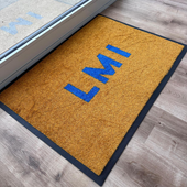
Using bold contrast, like white letters on a dark background, boosts visibility. Avoid low-contrast combinations, especially for small or thin text.
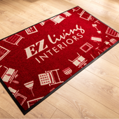
Examples of Effective Colour & Typography Pairings
-
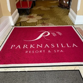
Navy + white sans serif font (professional)
-
Forest green + cream serif font (natural/luxury)
-
Bright red with black bold text (high energy)
High-Intent Phrases:
-
Easy-to-read font color combinations for logo mats
Technical Considerations for Logo Mat Printing
Manufacturer Guidelines for Colours and Fonts
Check with your printer about color limits. Most use Pantone color matches for mats and have restrictions on gradients.
File Formats, Color Codes (PMS), and Minimum Font Sizes
Send your logo in vector format (.AI, .EPS). Use PMS colors for accuracy. Make sure fonts are at least 1 inch high.
Common Design Mistakes to Avoid
-
Too many colors
-
Thin fonts
-
Low-contrast text
-
Light backgrounds that get dirty fast
SEO Keywords Integrated:
-
Logo mat design specifications
-
Minimum font size for printing
Designing with Durability and Cleanliness in Mind
Choosing Dirt-Hiding Colours for High-Traffic Areas
Stick with darker shades like charcoal, navy, or burgundy. These are dirt-hiding mat colors that stay fresher longer.
Selecting Weather-Resistant and Fade-Proof Colour Inks
If your mat will be placed outside, pick colors and inks that can handle the weather without fading. Your supplier can guide you toward fade-resistant fonts and colors for entrance mats.
Best Practices for Outdoor vs Indoor Logo Mats
-
Indoor: Focus on aesthetics and branding
-
Outdoor: Prioritize durability, drainage, and slip resistance
Tips to Align Logo Mats with Your Brand Guidelines
Using Your Brand Kit: Hex, Pantone, and Typography
Use your brand’s official colors and fonts. Your custom mat printing process should match your overall identity, from website to uniforms.
Keeping Your Logo Mat On-Brand and On-Message
Avoid experimental fonts or off-brand colors. Stick to your identity, especially in professional mat design.
Keywords That Build E-A-T & Consistency Signals:
-
How to use brand colors in logo mats
-
Branding with custom floor mats
Mockups and Testing: See Before You Print
Tools to Visualize Your Mat Design Before Finalizing
Many suppliers offer digital previews. Use these to test layout, color, and font choices.
Conducting Readability & Visual Contrast Tests
Print your design on paper at the actual size. Lay it on the floor and view it from a standing angle.
Frequently Asked Questions (FAQ)
What are the best colors for outdoor logo mats?
Deep hues like navy blue, dark green, or black are ideal since they mask dirt well and are less likely to fade quickly.
Which fonts are most readable on printed mats?
Clear, straightforward fonts like Arial or Helvetica usually offer excellent legibility on floor mats.
Can I use my brand’s gradient logo on a mat?
Most printers avoid gradients. Stick to flat PMS colors.
Do light-colored mats get dirty faster?
Yes, pale shades tend to show marks and dust quickly. It's best to use them indoors and only in areas with low foot traffic.
Can you match Pantone colors for custom mats?
Yes, but check with your vendor to confirm availability and extra fees.
Conclusion: Creating the Perfect Logo Mat That Lasts and Stands Out
Key Takeaways for Color & Font Selection
-
Choose colors that reflect your brand and hide dirt
-
Use easily readable fonts
-
Focus on contrast for better visibility
-
Stick to your brand guidelines for consistency
Final Design Tips for Brand-Consistent, Durable Mats
A good mat isn’t just about looks—it also needs to stand up to daily use. Consider how it functions and fits into your space, not just how it appears.
Want help creating your perfect mat? Contact us today for a free consultation and custom design mockup. We’re known for offering some of the most trusted custom logo mats in Ireland.